
Part 4 Specific Code on GitHub
If you search Google for Dynamics NAV item pictures you will find that there are a few examples out there for easily associating a picture with an item. However, there is not much on displaying multiple images for an item. This is a challenge I had to solve for my employer. Many items had anywhere from a single image to 10+ images.
I decided to come up with a .Net add-in control that was able to display multiple images for any given item and on any page (e.g. the item list, item card and beyond). I have decided to create a tutorial to show you how to create such a control. This will be quite lengthy, so I will split it up into smaller parts for you to digest more easily. The tutorial will be split into the following 7 part series:
- Part 1 – Introduction
- Part 2 – Creating the .Net image control model
- Part 3 – Creating the .Net image control viewmodel
- Part 4 – Creating the .Net image control view (this post)
- Part 5 – Creating the .Net add-in control wrapper class
- Part 6 – Creating the Dynamics NAV Item Images factbox page
- Part 7 – Hooking up the item Images factbox page
Part 4 – Creating the .Net Image Control View
Initial Preparation Notes
In this part of the tutorial we will be creating the main View and a small test project to test the functionality so far. If you haven’t already, I suggest you grab the source code from GitHub, so you can follow along. This will also allow me to skip going through the folder structure and project setup and focus on the code itself. Any other preparation steps and notes can be found in Part 2 of the tutorial.
MultiImageView Class
The main view of our multi-image control is the MultiImageView class. This class is a WPF UserControl object which we will create using as declarative markup language called XAML. The markup language has the added benefit of being backed by the type system and Intellisense in Visual Studio (just like doing regular coding). For an overview on XAML, checkout this overview. For this tutorial, the UserControl class will be responsible for our entire GUI (except when we wrap it inside a NAV page in Part 6). It is a little on the long side (just under 200 lines), so I will cover various parts and you can view the sample code to fill in any gaps.
UserControl Definition
We’ll start off with the UserControl definition. This is where we define the class name, any required namespace references (think using statements in regular C# code), dimension definitions and a few other tidbits.
A few things to note here:
- Our class name is the first line. This should be self explanatory.
- All xmlns lines are xml namespace (using) statements. These will be created for you (except the one referencing our view model) by default when you create a WPF UserControl in Visual Studio.
- The line listed as d:DataContext allows us to define a design-time ViewModel. This gives us Intellisense for public properties and commands. In addition we could use a test ViewModel with design-time data that will populate the control with data as if the control is running. I won’t be doing this in the demo (instead I just did a quick test project). You can read more about design-time data here or check out this tutorial.
UserControl Resources

Next up are some UserControl resource definitions. This is where you can create reusable styles and templates for the UserControl.
You have the option to create resources in a separate file and access them from various Views if you want to theme an application, but since we are creating just a single UserControl, I have put them directly in the UserControl resource section.
NOTE: There is quite a lot going on here and I won’t cover all of the details, but I’ll give enough information to cover the important aspects.
The basic idea is that we are creating a button that will not look like a button (hence the name InvisibleButtonStyle). This gives us the ability to wrap our thumbnail images inside a button that is invisible and bind it to the command responsible for setting the main image (buttons can bind to commands, whereas images cannot). The beauty of WPF is that almost any type of element can be composed of any other elements (for the most part). This allows things like buttons, containing grids, containing images and text and xyz. You are much less limited than your are with Windows Forms.
Grid Definitions
Most controls have a Grid as the main parent element. You can think of it as a table with rows and columns (which can be further divided into sub-rows and sub-columns and other elements can span multiple rows or columns).
Our Grid is fairly simple. We have two rows:
- The top row is for the main image. The height of * means take up all remaining space after the other row has been created and taken its allotted space. The main image will also span all three columns listed below.
- The bottom row is 75 units (device independent units, see here) and will house our scroll buttons and thumbnail images.
We also have three columns:
- The first column is 40 units and will contain the Previous Page button.
- The middle column (Width of *) will take up remaining space after the first and third columns have taken up their remaining space. This column is where the thumbnails will be displayed.
- The third column, like the first column is 40 units wide and will contain the Next Page button.
Main Image
The main image is an Image control inside of a Border. Originally I had a small border, but I decide to make it invisible because I didn’t like the look. I kept it around (even though it is invisible) so I could put a Margin on it causing a padding effect around the image (keeps a uniform padding around the image so it doesn’t go right to the edges of the control).
The Border is created in the first row and column of the Grid (0 based index) and has a column span of 3. It has a BorderThickness of 0, essentially making it invisible.
The Image has a Stretch property set to Uniform so that it keeps its aspect ratio. More interesting about the Image control is that is has the Source property bound to the MainImageSource property. This is defined in our backing ViewModel (from the previous turorial), which exposes where to grab the image from (could be a resource URI, file path etc.).
Navigation Buttons and Thumbnails Border

Next up is a subtle Border around the thumbnails and navigation buttons.
There is nothing exciting going on here. You can look into SystemColors and CornerRadius if you want to investigate some properties we have not seen yet.
The navigation buttons are basically identical, so I will just cover the Previous Page button. These buttons are responsible for cycling through pages of images when they cannot fit on a single page.
This looks scarier than it actually is. First off it is a RepeatButton, which does just what you would think. Holding down on it will cause the click to fire repeatedly. The button is bound to the PagePreviousCommand found in our ViewModel from the previous post in the series. If you recall, we had code on the command that decided if the button should be enabled or disabled (depending on if we could move to the previous page or not). This will come into play in the styling.
After the RepeatButton definition, the rest is a style definition. Rather than define the style in the UserControl resources like we did for our InvisibleButtonStyle, I have defined them inline. This is because I won’t quite be reusing the Style between both buttons. The interesting parts of the style are:
- We have two different styles depending if the button is enabled or disabled.
- We have defined our back button image using the Path Markup Syntax (basically we have drawn a filled triangle using markup language). I did this because it gives you scalable vector graphics rather than a bitmap/jpg/png that can be distorted easily. Another reason: We can, so why not? 😉
ItemsControl (Thumbnails)
The final piece of our View is the thumbnail images. Our thumbnail images are ImageViewModels that are part of the PageableItems collection. We can take advantage of the collection by using an ItemsControl (great tutorial here), which allows us to define how a single item should display. Then this template is reused for all items in the collection.
The ItemsSource binds to our collection. We then create an ItemsPanel and ItemsPanelTemplate as the main wrapper (in this case a horizontal StackPanel, which just stacks things side by side). Next we create our ItemTemplate, which is a button (using our InvisibleButtonStyle) containing an Image (bound to the current ImageViewModel’s image source). This allows us to click on the image and have it react like a button.
The button is bound to the DisplayLargeImage command from our PageableItemsControlViewModel (created in the previous blog post) and it passes the image that was clicked via the CommandParameter.
That’s it for the View. Next we will quickly show a little test project.
Test Project

In the sample code, I created a small WPF Application project inside the existing solution. It is a single WPF Window with a reference to the View we created.
That is the entire XAML code for the project! We could have also added the ViewModel here, but to show there are multiple ways to do things, I have done the ViewModel code in the code-behind. One quick note: The MultiImageView was given a name of View so that we could reference it in the code-behind. The actual name doesn’t matter, I could have called it MySuperAwesomeView.
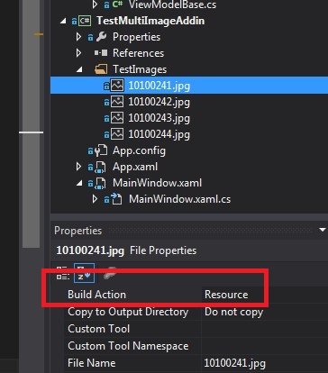
Test Images
Before we show the code-behind, I should mention that I created a TestImages folder and added four images to the project. For each image I changed the build type property to Resource.
To access these images, we’ll need to use the Resource File Pack URIs technique (you’ll see this shortly).
Test Window Code-Behind
The final part of our test project is the code-behind to hook up the ViewModel.
First we create our ViewModel, set the PageSize property to 3 (3 images per page). Next we need to create an ImageSourceConverter to convert our Resource File Pack URIs (strings) to image SourceProperty. We then create an image repository, create a list of images using our trusty converter and then add those images to the image repository. Lastly, we set the View datacontext to our ViewModel.
One final note about setting the datacontext. This overrides the one we set in the design-time datacontext at the beginning of the blog post (I believe the design-time datacontext is actually not compiled into the user control).
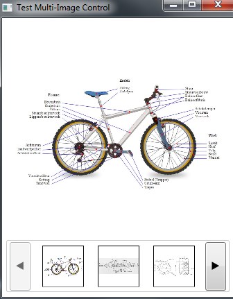
Here is a sample of our test project.
That’s it for Part 4. Next up: Part 5 – Creating the .Net add-in control wrapper class.